There’s a quiet alchemy in real paper: the whisper of a fold, the soft crackle of a deckled edge, the way a thumbprint fades into a crease. To invent flyers that feel remembered instead of merely seen, start by generating mood references with an AI photo generator in Dreamina — run material studies, close-ups of crumpled paper, and lighting that exaggerates grain. Those photographic moods will show you which textures read as worn, which look deliberately crafted, and which simply photograph well for social sharing. From there, you can design flyers that not only announce but also accumulate history.
This blog explores how to use simulated and real textures, folding mechanics, and finish treatments to create flyers that invite touch, tell stories, and live on coffee tables. Expect practical rules, a couple of short bullets for quick decisions, tactile mockup methods, and a Dreamina three-step workflow so you can move from concept to printable asset in an afternoon.
Paper that remembers: choosing an emotional substrate
Paper is more than substrate — it’s the first voice of your message. Rough cotton rag whispers craft; thin onion-skin suggests intimacy; translucent vellum hints at secrecy. Start by imagining the emotional weight you want: nostalgia, urgency, intimacy, or play. Then pick a base stock that already speaks that language. Note how finishing choices alter meaning: a soft-touch laminate says premium, deliberate; a natural deckle edge reads artisanal and older; a rugged kraft sheet implies thrift and grit.
Keep your palette aligned with the paper’s character: soft pastels on cotton, raw inks on kraft, high-contrast pigment on coated stock. When the paper and palette agree, every fold and scuff becomes legible.
Texture layering: build depth without noise
Good tactile design respects hierarchy. Texture should support the headline, not fight it. Use layers like an orchestra:
- Ground:the paper grain and base finish
- Pattern:a repeated texture (linen, halftone, or subtle dust) applied at low opacity
- Gesture: intentional marks (stamps, smudges, or hand-inked strokes) that localize attention
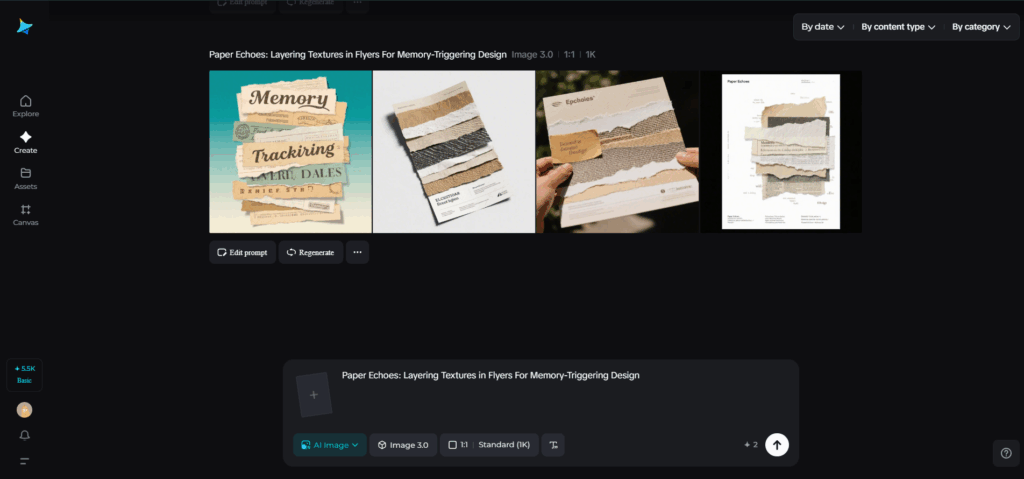
Apply textures with restraint. Too many competing marks create visual fatigue. Let one area host the boldest tactile statement — a finger-worn corner, a stamped emblem, or a clipped collage — and keep the rest calm. When it comes to crafting beautiful, memorable designs, the aim is to print flyers that resonate on a deeper level with their tactile elements. A flyer with well-thought-out textures will stick in the memory of the recipient, long after they’ve put it down.
Dreamina’s texture lab: Quick steps to prototype tactile flyers
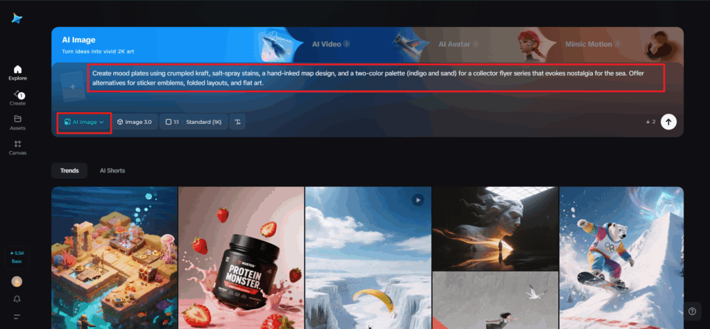
Step 1: Write a descriptive text prompt
Go to Dreamina and create a thorough prompt outlining the materials, deliverables, and tactile intent.
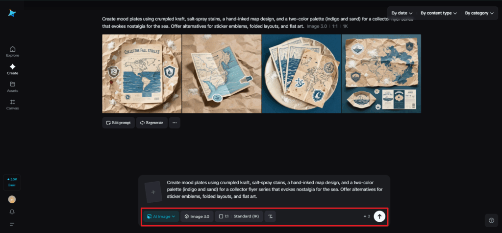
For instance: Create mood plates using crumpled kraft, salt-spray stains, a hand-inked map design, and a two-color palette (indigo and sand) for a 4×6 collector flyer series that evokes nostalgia for the sea. Offer alternatives for sticker emblems, folded layouts, and flat art.
This aids Dreamina in producing precise compositional references and texture explorations.
Step 2: Set parameters and generate
Choose a model favoring high-fidelity texture and illustrative detail, set aspect ratios for both flyer and close-detail crops, and choose size and resolution—1k for quick ideas, 2k for print-quality texture extraction. Click Dreamina’s icon to produce multiple directions, then select images that convey strong grain, believable creases, and clear negative space for type.
Step 3: Personalize and download
You can use Dreamina’s inpaint to clear unwanted artifacts, expand to create bleeds and fold margins, remove distracting marks, and retouch color to match Pantone references. Export high-resolution layered files and texture maps that your printer can use for embossing, spot varnish masks, and die-line alignment. Click the Download icon to save print-ready PDFs and separate sticker die files.

Photography and digital resonance
Even a tactile flyer lives twice: in hand and in feed. Make sure textures read in photos. When shooting mockups, light obliquely to exaggerate grain, use shallow depth-of-field to highlight edges, and photograph with a neutral background to let paper color remain true. If your flyer will be shared online, produce cropped compositions that show the tactile detail close-up — the corner fold, the ink impression — as well as the full object so viewers can imagine the physical scale.
Logos that leave fingerprints
A flyer’s textures don’t stop at paper — they echo through its identity marks. When your emblem feels embossed, scuffed, or stitched into the layout, it inherits the flyer’s memory. Experiment with Dreamina’s AI logo generator to test how your brandmark behaves when folded, stamped, or printed on rough stock. The result: a logo that doesn’t just appear, it lingers.
Quick tactile prototypes you can run today
- Print five copies on two different stocks (cotton rag and recycled kraft), fold them in your chosen mechanics, then photograph both handheld and flat to compare feel.
- Run a tiny test where you add a single finishing touch — edge paint or a small stamp — to half the batch and see which disappear fastest in distribution.
- Create a limited “artist’s distress” edition where each flyer is scuffed slightly by hand; sell or give them as numbered editions.
These tests reveal what people actually keep and what is merely admired.
Tiny typographic rules for textured surfaces
Texture competes with fine detail. Use a bold headline with open counters and drop subtle text-shadow or outline to maintain contrast. Avoid tiny serifs or delicate scripts for body copy on heavily textured backgrounds. When in doubt, use solid panels or translucent overlays as typographic fields to ensure your tactile flourishes never obscure important information.
Stickers, add-ons, and micro-collectibles
Small companions extend the life of a flyer. A die-cut emblem sticker, a tiny fold-out checklist, or a fabric swatch attached with a staple creates additional touchpoints. Dreamina’s sticker maker is perfect for prototyping die-cuts that echo your flyer’s most tactile motif — a torn edge silhouette or a thumb-worn emblem — cheaply and fast. Stickers travel: they leave the flyer behind and seed your visual language across laptops, water bottles, and scrapbooks.
Distribution as curation
If the flyer is intended to be collectible, distribute it like a curator, not a street sweeper. The place runs in independent bookstores, gallery shows, record shops, and boutique cafés where patrons appreciate tactile craft. Host a simple exchange event where people trade variants or sign an edition — an audience that participates becomes the artifact’s caretaker.
Measuring memory: what success looks like
Collectibility shows up as retention and resonance. Track:
- Physical reappearances (photos of flyers in notebooks or on walls)
- Social echoes (shares, saves, and repurposed photos)
- Demand signals (requests for reprints or variant swaps)
Listen to where people place the flyer; the chosen spot often reveals more than clicks.
Conclusion: design that ages with dignity
The goal of the paper is to design artifacts that accrue stories without becoming landfill. Prior to mass production, carefully layer textures, select interactions that encourage attention, and test out tactile impacts. Dreamina accelerates the research phase: generate texture studies, refine composition, and export separable textures and guidelines for print. When done right, a flyer becomes more than information — it becomes an object people tuck away, find months later, and remember the moment you asked them to touch.


